SIDE NOTES ABOUT THIS PROCESS
The process outlined above is intended for processing a full sheet of
8x10"
paper. Chemical quantities vary based on the surface area
of the prospective print, as well as the total volume of the drum
being used. For more information, consult the Print Drums section of
this guide.
The reason I suggest dumping
25% of your chemistry is to give you an indication of how exhausted
your working solution is becoming. In my experience with this
technique, by the time you are down to 100ml of working solution, you
are close to exhaustion, and it should serve as your last shot of the
batch.
Because your test prints are usually not full sized 8x10’s, but cut
down sheets covering about 1/4th the total surface area, you need not
dump/use as much chemistry as you would a full sheet of paper.
Alternatively, do not discard a fraction of your chemistry, but simply
keep track of how many prints you’ve made with the batch, and dump when
the batch is exhausted. (my experience is that 8 or 9 8x10’s from 300ml
of soup is possible.)
NOW WHAT?
You have your first
fully processed test strip. What does it tell you? Notice the
gradation. If instructions were followed, there should be 5 steps,
going from lightest to darkest.
Since we were working with
increments of 3 seconds, the lightest exposure would correspond to 3
seconds of exposure, the second lightest, 6 seconds, and so on, until
you get to 15 seconds at the darkest. If all is well, one of these
steps will obviate the correct exposure time: eg, you will think to
yourself: “6 seconds is a bit too light, whereas 12 seconds is a bit
too dark, but 9 seconds feels just right.”
So you’ve determined exposure.
What about the colour balance? That’s probably off too. You’d have to
be exceedingly lucky to get it right the first time, especially at the
standard starting point of 60M/60Y. Chances are, you’re too yellow, too
magenta, etc. It’s important to view your test print under good light
so you can make an objective decision. In an ideal world, you would
have a calibrated 5200K light source. Chances are, you don’t.
Fortunately, our planet is orbiting a powerful, colour calibrated, and
most importantly, FREE light source, so if you are printing at a
sensible hour, seize the opportunity and scrutinize your print using
daylight. From here, determine what filtration is needed, and then make
the necessary change in the darkroom.
Once
you are satisfied with the colour balance, it's time to try your hand
at a full size print! Be extra careful when handling the paper at this
stage, as you are now aiming for a finished, fine print, as opposed to
throwaway test strips. If all goes well, you will be looking at a well
exposed, properly balanced print! Hopefully you kept your negative dust
free, as this guide, like me, is staying away from spot toning.
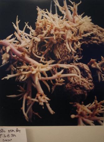
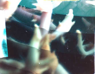
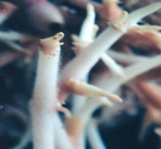
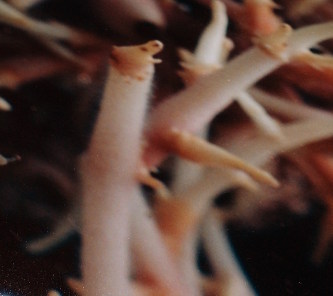
NOTE: The example pictures shown here are of a 20x24" print being made. All the same principles apply! The cyan was added in for neutral density (to extend print time), as I felt some dodging was necessary. I could have achieved this by closing down the lens past f/16, but likely at the cost of sharpness due to lens performance issues at extreme apertures (in this case, diffraction.)