IN THEORY
Now that we know what we need and our spaces are set up, some basic colour theory is in order! First and foremost, it is important to understand what the material you’re using actually does. The photographic paper you’re using is referred to as colour-negative, or chromogenic paper. Much like black & white photo paper, it is sensitive to light, and whatever impression light makes on it will register as its opposite. In the case of black & white paper, if an area is exposed to light, it becomes dark. This effect holds true for the entire gray scale; if an area is exposed with 20% gray, it registers as 80% gray. This is why a negative image projected onto paper yields a positive image.
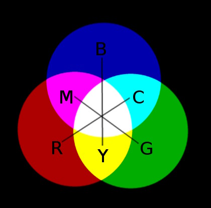
In the case of colour-negative
paper, this is also true, however, in addition to a grayscale, we now
have a full spectrum of visible colour to think about. If a region of
paper is exposed to cyan coloured light, it registers as red; magenta
registers as green; yellow registers as blue. Your negative contains
all of
this information. It is your job to ensure that the information is
properly translated to your paper. In a black & white
darkroom, your concern as a printer is to achieve a desirable tonal
range for your print through adequate exposure. In a colour darkroom,
your concern is to achieve a properly colour balanced print, in
addition to an acceptable tonal range. Assuming you have a proper
negative, correct tonal range is achieved by exposing the paper to
light of a set intensity for a set duration. Colour balancing is
achieved by manipulating the temperature of light that passes through
the negative as it’s being projected onto the paper. A dichroic colour
enlarger will typically have 3 dials: cyan, magenta, and yellow. The
dials are marked with units, usually referred to as ‘cc’ or ‘colour
compensation’ units, going anywhere from 1 to 180 on most enlargers
I’ve worked with. What should be noted, however, is that when you dial
in a colour, what you are actually doing is subtracting its complement.
This means, for example, that if you dial in magenta, you are taking
away green
light.
What does this all mean? Well, in practical terms, consider that your test print has a yellowish overall cast that you would like to get rid of. What kind of filtration does this require to correct?
If
the opposite of yellow is blue, you need more blue.
The paper is negative.
Dialing in more yellow takes away blue light.
In opposite land, the paper sees this as adding more blue light.
The yellow cast in the final print is reduced!
This might seem confusing, perhaps an avenue of cognition best left to philosophers. That is, however, what mental shortcuts are for! Because of the above, what happens in practice is:
- If the print is too yellow, dial in more yellow.
- If the print is too blue, you’ve dialed in too much yellow!
- If the print is too magenta, dial in more magenta
- If the print is too green, you’ve dialed in too much magenta!
Easy, right?!
Any other colour casts you will run into will be combinations of these colours (eg, red = magenta + yellow.), and the same principles apply. In practice, printers like to stay away from the cyan filter. The reason for this is that it adds neutral density (takes away light.) What is achieved by adding 20C can also be achieved by subtracting 20M and 20Y. Why complicate things? Neutral density can be desirable in certain circumstances, and will be discussed later.
In short, keeping all of the above in mind, you will be engaging in a process of trial and error (making test-prints) until the proper filtration and exposure are determined. From there, you create your full-size print with confidence! The more practice you have, the shorter this process becomes.